The Abstract Art of Interior Design: A Satirical Soirée Through Spatial Shenanigans
Welcome, dear reader, to the whimsical world of abstract interior design, where the rules are made up and the points don't matter! Prepare to embark on a journey through the looking glass of modern decor, where we'll explore the delightful absurdity of turning your living space into a veritable funhouse of form and function. Buckle up, buttercup, because we're about to dive headfirst into a realm where throw pillows are considered high art and the proper placement of a coffee table is akin to solving a Rubik's Cube blindfolded.
The Unity and Harmony of Chaos: A Delightful Contradiction
Ah, unity and harmony – those elusive twins of interior design that every homeowner desperately seeks, like a suburban dad hunting for the perfect lawn ornament. According to the gospel of design gurus, your home should be a 'totality,' a series of spaces linked together by halls and stairways. But let's be real, shall we? The only thing linking most of our spaces is a trail of dirty socks and empty coffee mugs.
Nevertheless, fear not! You too can achieve this mythical 'unity' by simply slapping the same color scheme throughout your entire house. Because nothing says 'cohesive design' quite like being able to play hide-and-seek in plain sight against your perfectly color-coordinated walls.
"A designer's own space is an experiment in living as they wish and not as a client commands," says William Norwich, clearly unaware that most of us are living in spaces commanded by our landlords, pets, and the inexplicable collection of mismatched IKEA furniture we've accumulated over the years.
Balance: The Art of Pretending You Have Your Life Together
Now, let's talk about balance – not the kind you desperately try to maintain after a few too many glasses of wine, but the visual kind that's supposedly crucial in interior design. There are three types of balance: symmetrical, asymmetrical, and radial.
Symmetrical balance is for those who still color inside the lines and organize their sock drawer by color. It's the design equivalent of wearing matching socks – admirable, but let's face it, a bit boring.
Asymmetrical balance, on the other hand, is for the rebels, the free spirits, the ones who think matching socks are for conformists. It's casual, less contrived, and perfect for those of us who consider 'organized chaos' a lifestyle choice.
And then there's radial symmetry, which is when all elements are arrayed around a center point. It's like a design merry-go-round, perfect for those who enjoy getting dizzy in their own living room.
Focal Points: Because Staring at Your Phone Isn't Enough
Interior design's biggest enemy, we're told, is boredom. Heaven forbid we should have a moment of peace in our own homes! No, no, we must have focal points – dominant features that draw the eye and encourage the viewer to look further. Because apparently, we're all goldfish who need constant visual stimulation lest we forget where we are.
A fireplace or a flat TV is the classic example of a focal point. But let's get creative, shall we? Why not make that pile of laundry you've been ignoring for weeks the centerpiece of your room? It's dominant, it certainly draws attention, and it's bound to encourage viewers to look further – preferably in the direction of the nearest exit.
Rhythm: The Beat Goes On (And On, And On...)
In music, rhythm is the beat or pulse. In interior design, it's all about visual pattern repetition. It's defined as continuity, recurrence or organized movement. In other words, it's the design equivalent of that annoying song that gets stuck in your head and won't leave.
To achieve rhythm in your space, you need to think about repetition, progression, transition and contrast. Or, you could just scatter identical throw pillows around your room like confetti and call it a day. Voilà! Rhythm achieved.
Details: Because the Devil Needs Something to Do
Ah, details – the bane of every procrastinator's existence. Apparently, everything from the trimming on the lamp shade to the color of the piping on the scatter cushion needs attention. It's like the universe is personally offending those of us who consider 'close enough' a design philosophy.
"Unlike color people find details boring. As a result it gets neglected and skimmed over or generally left out," says some poor, detail-obsessed soul who's clearly never experienced the joy of blissful ignorance.
The Great White Debate: A Study in Sterility
Now, let's address the elephant in the room – or rather, the lack thereof in stark white interiors. These pristine spaces may look stunning in curated Instagram posts, but in reality, they're about as welcoming as a dentist's waiting room.
Imagine, if you will, a world where every surface is as white as the driven snow. Sounds peaceful, right? Wrong. It's a world where every coffee spill, every smudge, every speck of dust stands out like a guilty conscience. It's not a living space; it's a life sentence of constant cleaning and anxiety.
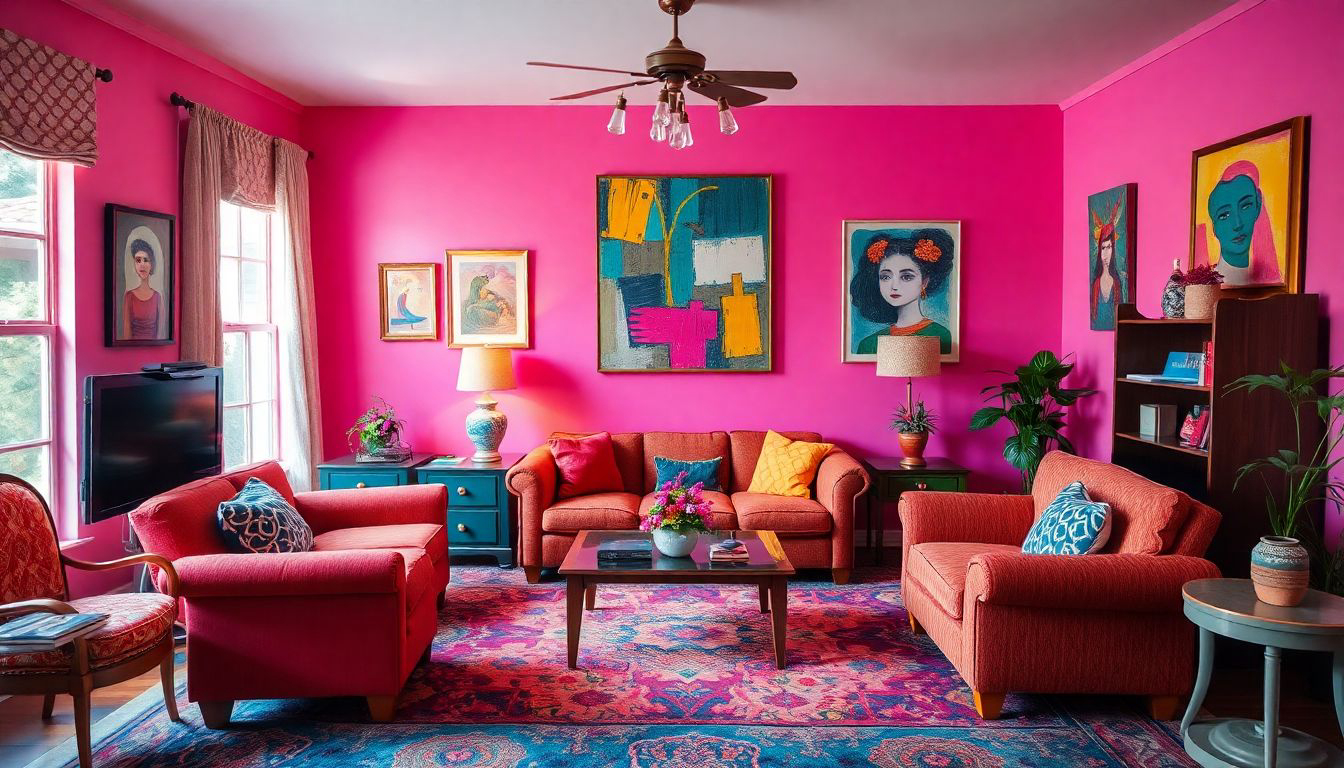
Instead of this monochromatic madness, why not embrace the beautiful chaos of color? After all, life is messy, and your home should reflect that. Plus, it's much easier to hide wine stains on a colorful rug than on a white one. Just saying.
The Deconstructed Kitchen: Because Who Needs Cabinets Anyway?
In a world where kitchen cabinets can cost more than a small car, some brave souls have decided to throw caution (and cabinet doors) to the wind. Enter the deconstructed kitchen – a concept that's part industrial chic, part 'I couldn't afford actual cabinets.'
This trend involves using existing pieces of furniture, antique or new, instead of traditional cabinetry. It's like playing house, but with real furniture and actual food. Want to store your plates? Why not use that vintage dresser you found at a flea market? Need a place for your spices? That old ladder leaning against the wall will do nicely.
The best part? When you move, you can take it all with you. It's like a kitchen and a moving van had a baby, and it's surprisingly charming.
The Art of Artful Dodging: Designing Around Your Masterpieces
For those of us fortunate enough to own actual art (and no, your collection of movie posters doesn't count), there's the challenge of designing a room without upstaging your precious pieces. It's a delicate dance, like trying to compliment your boss's new haircut without sounding insincere.
The key, apparently, is to create a "peaceful home" as an "antidote to sensory overload." Because nothing says "peaceful" quite like tiptoeing around your living room, terrified of knocking over that priceless sculpture you impulse-bought at an auction after one too many glasses of champagne.
Remember, your home should be a refuge, not a museum. Unless, of course, you enjoy living in a space where you're afraid to sit on your own furniture.
The Seven Deadly Formulas of Living Room Layout
Ah, the living room – that sacred space where we pretend to read books when guests come over. Designing this room, we're told, is like putting a puzzle together. Except this puzzle comes without a picture, half the pieces are missing, and you're doing it blindfolded while riding a unicycle.
But fear not! Interior designers have graciously provided us with seven formulas for the perfect living room layout. Because if there's one thing that screams "personal" and "homey," it's following a strict set of mathematical equations to arrange your furniture.
These formulas cover everything from the optimal rug size to the perfect height for your coffee table. Because heaven forbid your coffee table be an inch too high – the design gods might smite you with a bolt of poorly coordinated throw pillows.
Conclusion: The Joy of Imperfection
In the end, dear reader, remember this: your home is your castle, your sanctuary, your own personal padded cell to protect you from the chaos of the outside world. Whether you choose to follow these design principles to the letter or throw caution to the wind and arrange your furniture by consulting a Ouija board, the most important thing is that your space makes you happy.
After all, in the grand tapestry of life, we're all just trying to create a cozy corner where we can Netflix and chill without judgment. So go forth, break some rules, mix some materials, and for the love of all that is holy, buy a plant that isn't plastic. Your space will thank you for it.
And remember, if all else fails, you can always fall back on the ultimate interior design hack: dim lighting and strategically placed mirrors. Because in the right light, even that old futon from college can look like a million bucks.
References and Further Reading
- Concept Ideas for Interior Design
- The Language of Interior Design
- Eight interiors styles – as seen inside designers' own homes
- 5 Most Important Interior Design Principles
- How to Decorate Your Home
- How Mixing Materials Brings Luxury to Interior Design
- How To Design a Room Without Upstaging Your Art
- The Right Way to Lay Out Your Living Room: The 7 Formulas Interior Designers Rely On
Now go forth and design, you magnificent, chaotic creatures!
More Articles
The Transformative Power of Interior Design: Why It Matters More Than Ever
The Artisan's Touch: Elevating Interiors Through Craftsmanship and Design

Moroccan Interior Design: A Satirical Journey Through the Land of Poufs and Patterns
70s Interior Design: A Groovy Revival for Modern Homes

Exploring Interior Design Salaries: Trends, Factors, and Career Prospects
